Metabolomics Creative Proteomics
Sample Submission Guidelines Inquiry
Request a Quote

Metabolomics Data Analysis Service — From Raw Spectra to Biological Insight

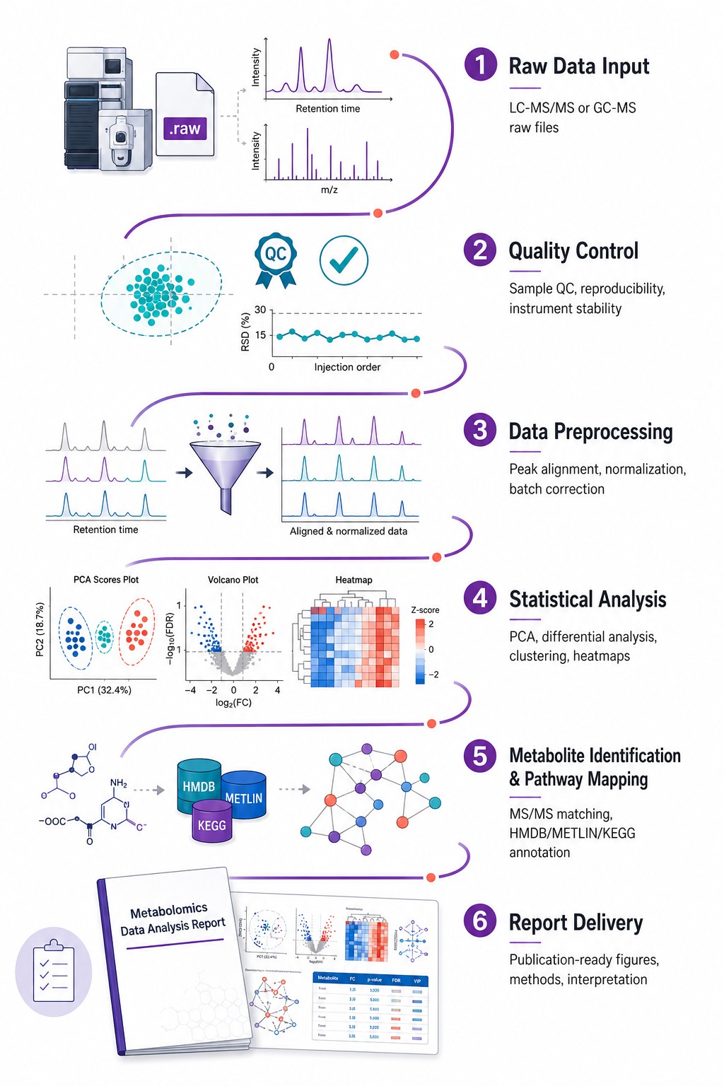
You have the data. We turn it into answers. Our bioinformatics team handles every computational step — preprocessing, statistics, metabolite identification, pathway enrichment, multi-omics integration — and delivers publication-ready figures, methods documentation, and a biological interpretation you can defend to reviewers. Accept raw instrument files from any vendor, processed peak tables, or public repository datasets — platform-agnostic, fully reproducible, all parameters documented.

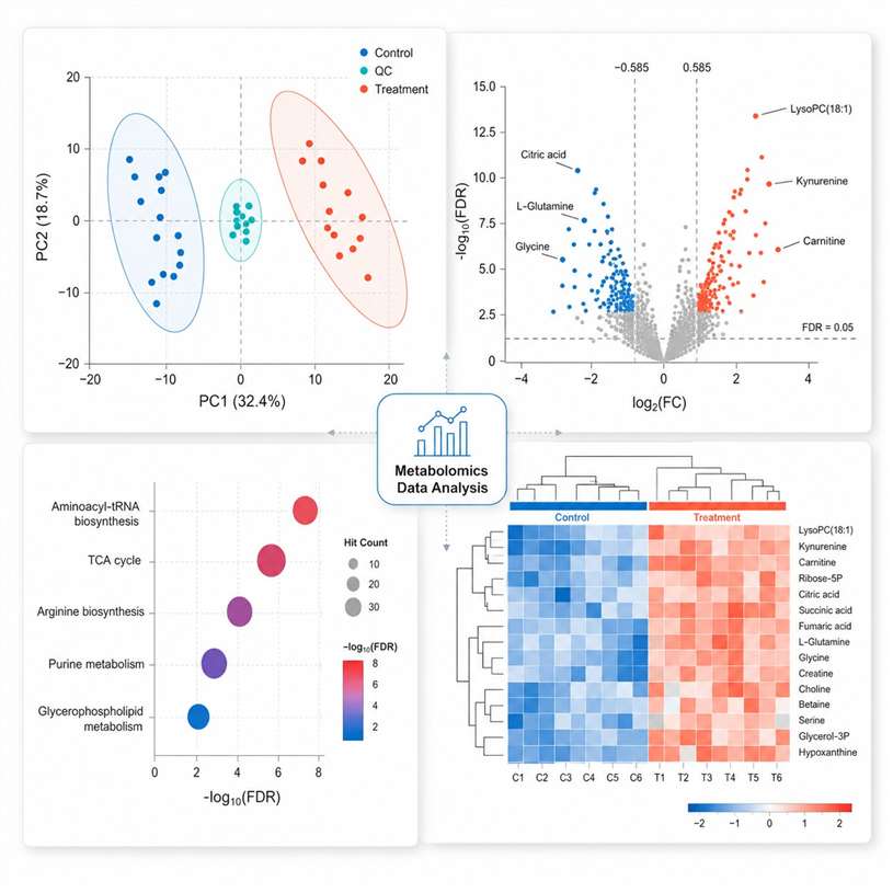
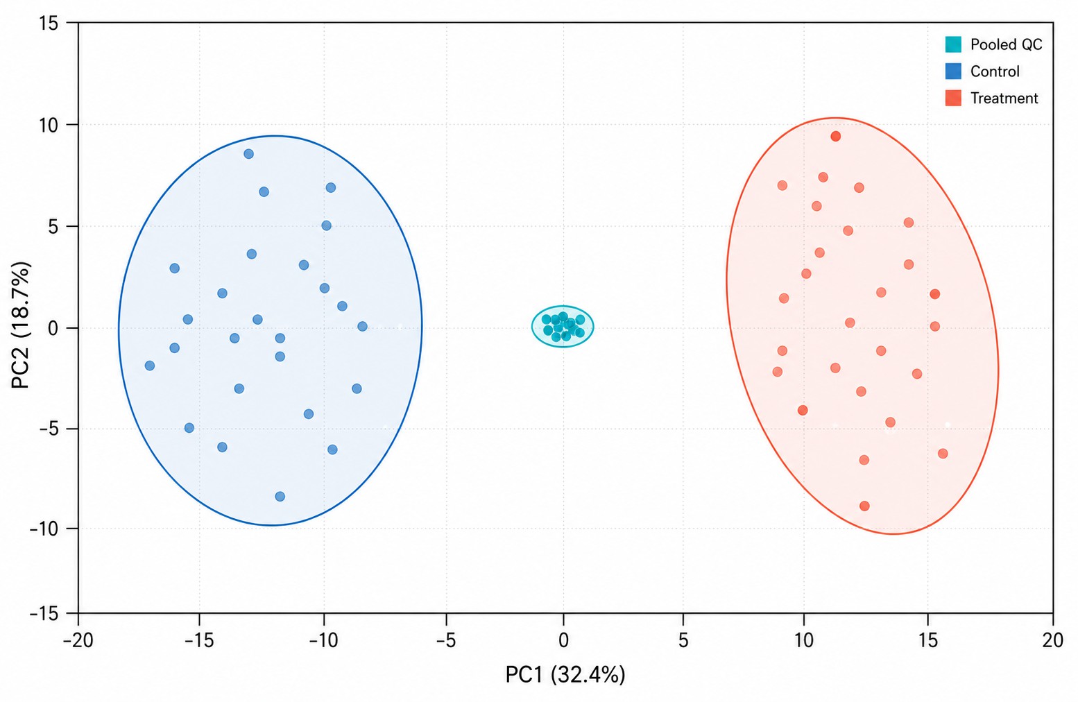
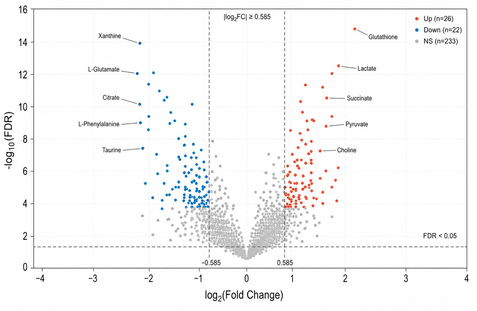
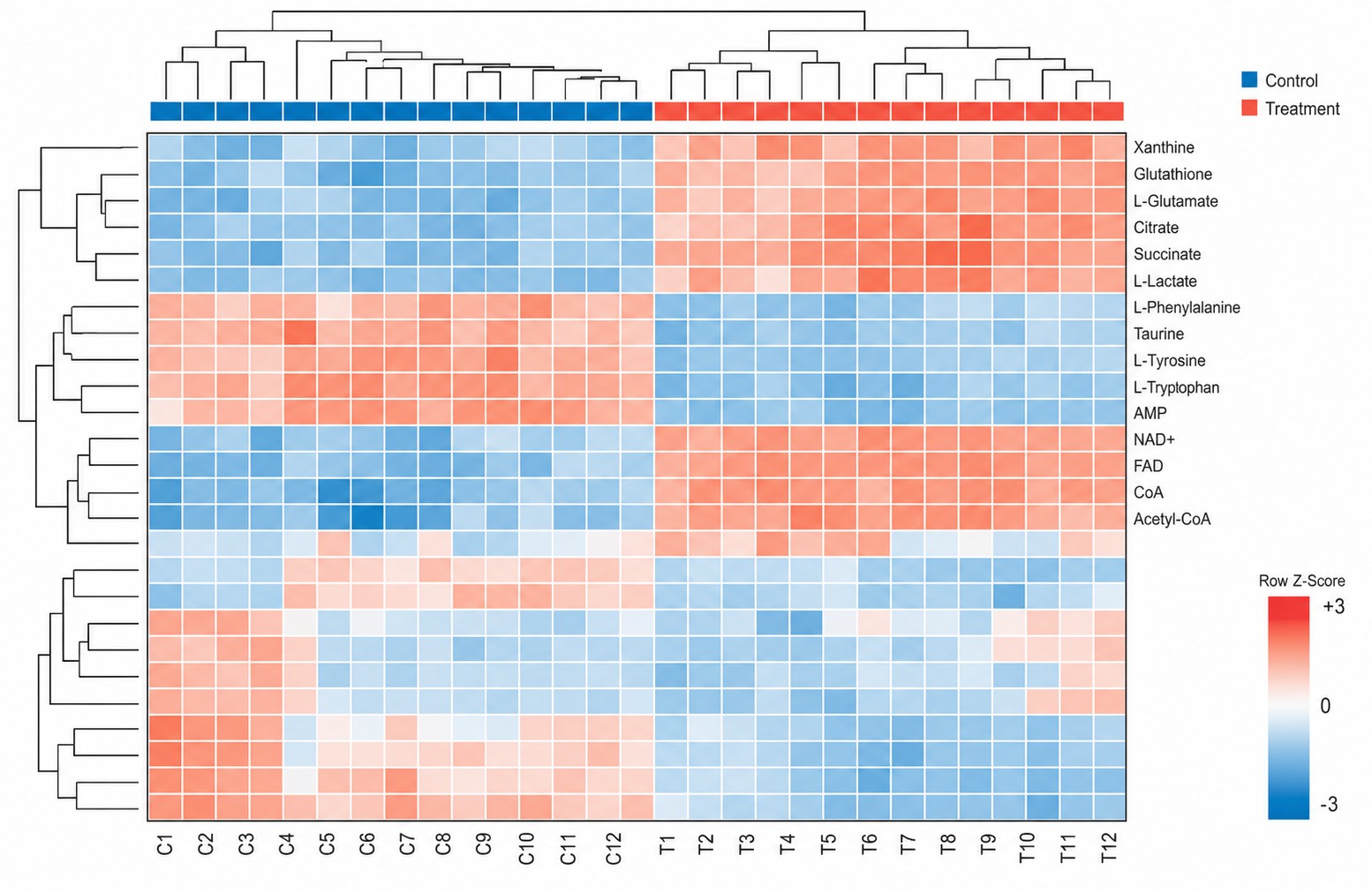
Multivariate statistics: PCA, PLS-DA, OPLS-DA with permutation testing (n≥1,000), hierarchical clustering, volcano plots

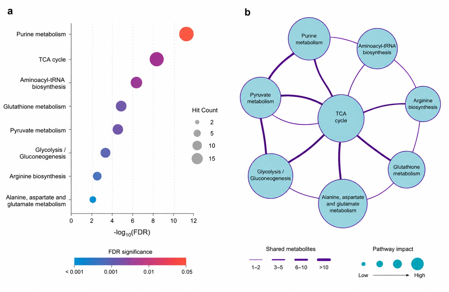
Pathway enrichment (KEGG, Reactome) and metabolic network analysis with FDR correction at every step

Multi-omics integration: DIABLO, MOFA+, O2PLS — metabolomics + proteomics + transcriptomics + lipidomics

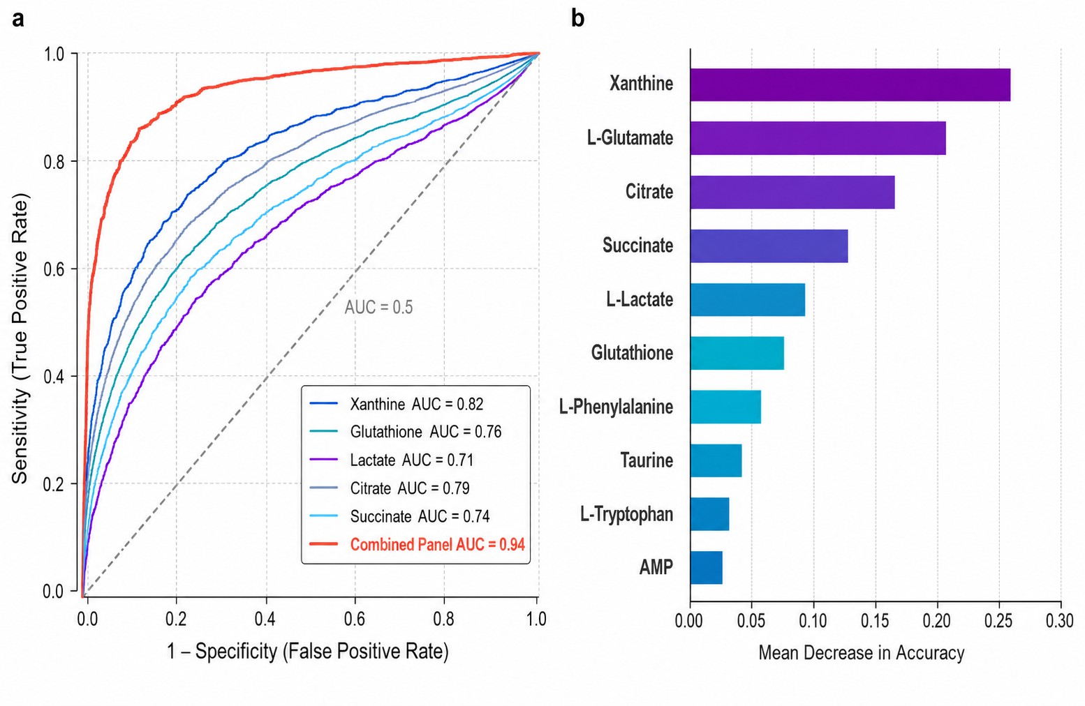
Machine learning & biomarker discovery: random forest, SVM, XGBoost, ROC analysis, multi-metabolite panels

Platform-agnostic: .mzML, .raw, .d, .wiff, .cdf, .csv — your data or ours, same rigorous pipeline

Metabolomics Data Analysis Deliverables — PCA Scores Plot Volcano Plot KEGG Pathway Enrichment and Hierarchical Clustering Heatmap Publication-Ready Figures Preview

A peak table of 2,000+ features is not a result. A KEGG pathway ID is not a biological conclusion. Our data analysis service transforms raw metabolomics output into statistically validated, biologically interpreted, and publication-ready deliverables. Every project includes complete methods documentation — software versions, parameter settings, statistical thresholds, random seeds — so your methods section writes itself and your results are computationally reproducible. For sample-to-report metabolomics services including data generation, see our targeted metabolomics and untargeted metabolomics platforms.

How We Analyze Your Metabolomics Data — Core Methods & Tools

Not every dataset needs every method. Below is what we use, what each method does, and when it is appropriate — so you understand exactly how your data will be handled.

Analysis Method What It Does When to Use
PCA
(Principal Component Analysis)
Unsupervised dimensionality reduction. Projects high-dimensional metabolomics data onto 2–3 principal components, revealing natural grouping, outliers, and batch effects without using group labels. Initial data exploration, QC assessment (pooled QC clustering), detecting unexpected patterns or confounders before hypothesis testing. Every project starts here.
PLS-DA / OPLS-DA Supervised classification that maximizes separation between pre-defined groups. OPLS-DA separates predictive (group-discriminating) from orthogonal (within-group) variation. VIP scores rank metabolites by contribution to group separation. Two-group or multi-group comparisons where you want to identify which metabolites best discriminate your conditions. Requires permutation testing (n≥1,000) to validate the model is not overfitting.
Hierarchical Clustering Groups samples and/or metabolites by similarity using distance metrics (Euclidean, Pearson, Spearman) and linkage methods (Ward, complete, average). Visualized as annotated heatmaps with dendrograms. Visualizing global metabolomic patterns across samples, identifying metabolite modules that co-vary, quality-checking replicate consistency, supporting pathway-level interpretation.
Volcano Plot + FDR Displays fold-change (biological effect size) against statistical significance (-log₁₀ FDR) for every metabolite. FDR correction (Benjamini-Hochberg) controls expected false discovery proportion across all tests. Standard output for any two-group comparison. Set your FC and FDR thresholds (e.g., |log₂FC|≥0.585, FDR<0.05) to define "significantly changed" metabolites.
Pathway Enrichment (ORA + MSEA) Over-Representation Analysis: hypergeometric test — are your significantly changed metabolites enriched in specific KEGG/Reactome pathways more than chance? MSEA: uses quantitative fold-change data from ALL detected metabolites, not just significant ones. Translating a list of changed metabolites into biological meaning. Use ORA when you have a clear significant subset. Use MSEA when you want a more holistic view incorporating fold-change magnitude and direction.
Random Forest / SVM / XGBoost Machine learning classifiers that learn metabolite patterns discriminating groups. Feature importance ranking identifies the most predictive metabolites. k-fold cross-validation + independent test set assess real-world performance. Biomarker discovery, diagnostic/prognostic panel construction, identifying non-linear metabolite interactions. Requires sufficient sample size per group (n≥20 recommended for stable models).
Multi-Omics Integration (DIABLO / MOFA+) DIABLO: supervised multi-block integration maximizing covariance across metabolomics, proteomics, and transcriptomics while discriminating groups. MOFA+: unsupervised factor analysis discovering latent drivers of variation across omics layers. When you have 2+ omics datasets from the same samples and want to identify cross-platform correlations, shared biological signals, and omics-specific variation. Our multi-omics integration service provides full project execution.
WGCNA / Correlation Networks Weighted correlation network analysis: identifies modules of co-varying metabolites, correlates modules with experimental traits, identifies hub metabolites within modules. Gaussian graphical models for partial correlation networks. Discovering metabolite-metabolite relationships, linking metabolite clusters to phenotypes, identifying central regulatory metabolites. Works well with ≥15 samples per group.

Data Analysis Workflow — What Happens to Your Data

1

Ingestion & QC

  • Accept .mzML, .mzXML, .raw, .d, .wiff, .cdf, NMR, .csv/.txt peak tables — any vendor, any format
  • TIC inspection, blank subtraction, IS recovery check, PCA of pooled QCs for reproducibility pre-check
2

Preprocessing

  • Peak alignment (OBI-Warp, LOESS), normalization (LOESS/quantile/IS-based), missing value imputation (kNN, BPCA)
  • Batch correction (ComBat, QC-RLSC), feature filtration (RSD >30% flagged, blank removal, adduct deconvolution)
3

Statistics

  • Univariate: t-test/Mann-Whitney, ANOVA/Kruskal-Wallis — all FDR-corrected. Volcano plots, box/violin plots
  • Multivariate: PCA, PLS-DA, OPLS-DA (permutation n≥1,000, R²Y/Q²Y, VIP). Hierarchical clustering + heatmaps
4

Identification

  • MS/MS matching: HMDB, METLIN, MassBank, GNPS, in-house libraries. MSI Level 1–4 confidence per metabolite
  • Accurate mass (±5 ppm), isotopic pattern, RT filtering, in silico fragmentation (SIRIUS, MS-FINDER)
5

Pathway & Network

  • ORA (KEGG/Reactome/HMDB, hypergeometric test + FDR). MSEA (quantitative, fold-change-aware)
  • Integrated pathway maps with node coloring by FC direction. Multi-pathway network diagrams.
6

Report & Figures

  • 300 DPI TIFF + vector PDF/AI figures formatted to journal specs. Methods section ready for manuscript.
  • R Markdown/Jupyter notebook (complete code). Processed data tables (Excel + CSV). Biological interpretation.
Metabolomics Data Analysis Workflow — Six-Step Bioinformatics Pipeline from Raw Data to Publication-Ready Report

Advanced & Custom Data Analysis

Service What We Deliver
Biomarker Discovery & ROC Analysis Single-metabolite ROC (AUC, sensitivity/specificity, Youden cutoff). Multi-metabolite panel via logistic regression. Cross-validated AUC, DeLong test for panel comparison. Forest plots and nomograms for panel visualization.
Multi-Omics Integration DIABLO (supervised N-integration, 3+ omics), MOFA+ (unsupervised factor discovery), O2PLS (two-block predictive). Circos plots, multi-omics heatmaps, integrated KEGG maps showing per-omics contribution.
Time-Series & Longitudinal Analysis Repeated-measures ANOVA, linear mixed-effects models, ASCA (time × treatment decomposition). Mfuzz/STEM clustering for temporal trajectories. AUC calculation per metabolite. Trajectory plots and time-course heatmaps.
Correlation & Network Analysis Pairwise correlation (Pearson/Spearman/Kendall, FDR-corrected). Gaussian graphical models (partial correlation). WGCNA: module detection, trait association, hub identification. Cytoscape-compatible network exports.
Feature Selection & Dimensionality Reduction RFE, LASSO, elastic net, random forest importance, mutual information selection. Stability assessment across subsets. t-SNE, UMAP for non-linear structure visualization.
Custom Pipeline Development Bespoke R/Python scripts, automated reporting (R Markdown/Jupyter), custom database integration, publication-specific visualizations. All code fully commented and delivered for re-use — no black boxes.

Data We Accept — Any Platform, Any Format

Data Type Accepted Formats Metadata Required
LC-MS Raw .mzML (preferred), .mzXML, .raw (Thermo), .d (Agilent), .wiff (SCIEX) Sample ID, group, injection order, sample type (study/QC/blank)
GC-MS Raw .mzML, .mzXML, .cdf, .d (Agilent ChemStation) Sample ID, group, derivatization batch, injection order
Peak Tables .csv, .txt, .xlsx Rows=features, cols=samples + separate metadata file
NMR Bruker folder, .mnova, .jdx (JCAMP), bucket tables (.csv) Sample ID, group, field strength, pulse sequence
Public Repositories MetaboLights, Metabolomics Workbench, GNPS/MassIVE Study accession ID (MTBLSxxxx, STxxxxxx)

To begin: Send your data files + a sample metadata table (Sample ID, Group, Batch, Injection Order, Sample Type, covariates) + experimental design description. Large datasets (≥50 GB): secure FTP available. Initial QC report within 2 business days.

Deliverables — What You Receive, With Visual Examples

Metabolomics Data Analysis — PCA Scores Plot Showing QC Sample Clustering and Biological Group Separation with 95% Confidence Ellipses

Multivariate Analysis & Group Separation

PCA scores plot (centroid ± 95% CI ellipses, % variance per PC). PLS-DA / OPLS-DA scores plot with permutation test validation inset (n≥1,000). VIP bar chart ranking metabolites by discriminatory power. Model metrics: R²Y, Q²Y, CV-ANOVA p-value. All 300 DPI TIFF + editable vector PDF/AI, formatted to journal specs. The PCA plot above shows pooled QCs tightly clustered near center confirming analytical stability — transparent data quality evidence included with every project.

Metabolomics Data Analysis — KEGG Pathway Enrichment Bubble Chart and Shared-Metabolite Network Map for Biological Interpretation

Pathway Enrichment & Biological Interpretation

ORA + MSEA results: enriched pathways (KEGG/Reactome/HMDB), FDR, topology impact score, hit metabolites per pathway. KEGG pathway maps with nodes colored by fold-change direction. Integrated network maps connecting co-enriched pathways by shared metabolites — as shown above. Biological interpretation narrative connecting metabolite-level changes to pathway function for your manuscript discussion.

Metabolomics Data Analysis — Volcano Plot Showing Differential Metabolites with Fold-Change and FDR Significance Thresholds

Differential Metabolites & Volcano Plots

Complete univariate results table: fold-change, p-value, FDR q-value, VIP score per metabolite. Volcano plot with |log₂FC| ≥ 0.585 and FDR < 0.05 thresholds marked — as shown above with up-regulated metabolites in coral and down-regulated in blue. Box plots and violin plots for top differential metabolites. Pairwise comparison tables with post-hoc results for multi-group designs.

Metabolomics Data Analysis — Hierarchical Clustering Heatmap with Dendrograms and Group Color Bars for Global Metabolomic Pattern Visualization

Hierarchical Clustering & Heatmaps

Annotated heatmap with sample and metabolite dendrograms (Euclidean/Pearson, Ward/complete linkage) as previewed above. Class labels and group color bars for clear visual interpretation. Cluster stability assessed by bootstrap resampling. Interactive zoomable HTML heatmaps available on request for large datasets.

Metabolomics Data Analysis — Machine Learning ROC Curves and Feature Importance Ranking for Biomarker Discovery

Machine Learning & Biomarker Reports

Cross-validated model performance: confusion matrix, ROC curves with AUC per metabolite and for multi-metabolite panel — as shown above. Feature importance ranking (SHAP values, random forest importance). Multi-metabolite panel nomograms for translational research. Independent test set validation included for all models.

Metabolomics Data Analysis — Complete Analysis Report Package with Statistical Results Data Tables and Reproducible Code Notebook

Complete Data Package & Reproducible Code

Normalized peak intensity matrix (Excel + CSV). Metabolite annotation table (MSI Level 1–4, HMDB/METLIN/KEGG IDs, matching scores). Full statistical results table. R Markdown / Jupyter notebook with complete annotated analysis code — run, verify, and modify independently. Methods documentation ready for manuscript submission. The report preview above shows the depth and organization of your final deliverable package.

Why Researchers Trust Our Data Analysis

500+ Projects Completed

Metabolomics data analysis projects across targeted, untargeted, GC-MS, and NMR datasets — from 6-sample pilot studies to 500+ sample cohort analyses with multi-omics integration.

200+ Publications Supported

Our analysis results appear in Nature Communications, EMBO Journal, Cell Reports, Nature Metabolism, and 200+ other peer-reviewed journals. Methods documentation written for reviewer scrutiny from the start.

Dedicated Bioinformatics Team

Not generalist programmers running default settings. Metabolomics-trained bioinformaticians who understand chromatography, mass spectrometry, and biochemistry — and how each affects downstream data analysis decisions.

100% Reproducible

Every project delivered with complete R Markdown/Jupyter notebooks. Software versions, parameter settings, random seeds — all documented. Run the code yourself, verify every number, modify for follow-up analyses.

Case Study — Multi-Omics Data Analysis Identifies Xanthine as a Pro-Survival Metabolite

Multi-omics identify xanthine as a pro-survival metabolite for nematodes with mitochondrial dysfunction

Gioran, A., Piazzesi, A., Bertan, F., et al. | The EMBO Journal, 2019

DOI: 10.15252/embj.201899558


The Analytical Challenge

Mitochondrial dysfunction triggers widespread metabolic adaptation, but distinguishing adaptive changes that promote survival from passive consequences of respiratory chain failure requires integrating multiple data types — gene expression, metabolite levels, and metabolic flux — with rigorous statistical methods. Among hundreds of dysregulated metabolites, which one is functionally causal to the survival phenotype?

How the Data Analysis Answered It

Analysis Performed Key Finding
Transcriptomics + Metabolomics Integration RNA-seq identified upregulation of purine metabolism genes (xdh-1). Untargeted metabolomics confirmed the functional consequence — 8.4-fold xanthine accumulation (FDR p = 0.0012). Gene expression changes alone (2–3 fold) would not have flagged this pathway as functionally significant.
¹³C Isotope-Labeled Flux Analysis Confirmed increased metabolic flux through purine degradation toward xanthine — active production, not passive pooling. Distinguished xanthine from other accumulated metabolites that were merely accumulating due to slowed consumption.
Functional Validation RNAi knockdown of xdh-1 reduced xanthine and decreased lifespan — closing the loop from statistical correlation to causal mechanism. Without metabolomics flagging xanthine as the top hit, this target would never have been tested.

How Our Service Delivers the Same Rigor

This study used the exact analytical workflows we provide: untargeted metabolomics preprocessing (peak alignment, QC normalization), statistical comparison with FDR correction, cross-platform transcriptomics-metabolomics correlation, integrated KEGG pathway mapping (gene expression + metabolite fold-change overlaid on purine metabolism), and ¹³C isotopologue distribution analysis — all from raw instrument files to biologically interpreted results with complete computational reproducibility.

Reference

  1. Gioran, A., Piazzesi, A., Bertan, F., et al. Multi-omics identify xanthine as a pro-survival metabolite for nematodes with mitochondrial dysfunction. The EMBO Journal 38, e99558 (2019).

Frequently Asked Questions About Metabolomics Data Analysis

What types of metabolomics data can you analyze?

All major workflows: targeted LC-MS/MS (MRM), untargeted LC-MS (DDA/DIA), GC-MS, CE-MS, and NMR. Raw files from SCIEX, Thermo, Agilent, Waters, Bruker; processed peak tables (.csv, .txt, .xlsx); public datasets from MetaboLights, Metabolomics Workbench, and GNPS/MassIVE. Data from Creative Proteomics, your own lab, or any third party — pipeline is identical regardless of source.

How do you control for false discoveries?

At every stage: (1) QC-based feature filtration — RSD >30% in pooled QCs flagged before testing; (2) FDR correction (Benjamini-Hochberg) on all univariate tests; (3) permutation testing (n≥1,000) for PLS-DA/OPLS-DA — model only considered valid if Q²Y intercept <0.05; (4) k-fold cross-validation + independent test set for machine learning; (5) pathway enrichment FDR correction. Every threshold documented in your methods report.

Can you analyze data from any mass spectrometry platform?

Yes, fully platform-agnostic. Submit data from your instrument, a collaborator's lab, any CRO, or a public repository. Analysis quality is identical. Need data generation too? Our metabolomics platform provides complete sample-to-report workflows with a single contact for chemistry and bioinformatics.

How long does data analysis take?

Standard pipeline (preprocessing + statistics + pathway enrichment + figures): 2–4 weeks. Projects with machine learning, multi-omics integration, or custom development: 4–6 weeks. Expedited analysis available for manuscript revisions (1–2 weeks). We provide a detailed timeline based on your dataset size and scope during initial consultation.

What do I need to submit to get started?

Send us: (1) your data files organized by batch; (2) a sample metadata table (Sample ID, Group, Batch, Injection Order, Sample Type, covariates); (3) experimental design description (groups, pairing, replicates, hypotheses). Large datasets (≥50 GB): secure FTP available. We confirm data integrity within 2 business days.

What do I receive at the end of the project?

Complete analysis package: Statistical Report (all univariate + multivariate results, model metrics); Publication-Ready Figures (PCA, PLS-DA, volcano, heatmap, pathway enrichment, box plots — 300 DPI TIFF + vector PDF/AI); Metabolite Annotation Table (MSI Level 1–4, HMDB/METLIN/KEGG IDs); Pathway Enrichment Results with KEGG maps and interpretation; Methods Documentation (ready for manuscript); Reproducible Code (R Markdown/Jupyter); Processed Data Tables (Excel + CSV).

Can you work with my existing statistical analysis and just do the parts I need?

Yes. Modules are available individually — if you have already done preprocessing and need only pathway enrichment, or have statistics done and need multi-omics integration, we pick up where you left off. We also review existing analyses before building on them to ensure the upstream work is sound.

How do you screen for differential metabolites?

Differential metabolites are identified using combined thresholds from univariate and multivariate statistics. The standard approach applies VIP > 1 (from PLS-DA/OPLS-DA) AND P < 0.05 (from t-test or ANOVA). For stricter screening: raise the VIP threshold (e.g., VIP > 2) or lower the P-value cutoff (e.g., P < 0.01). Fold-change (FC) can also be incorporated — |log₂FC| > 1 (i.e., FC > 2 or FC < 0.5) combined with VIP and P-value thresholds. When these criteria are too stringent for your dataset, we can widen thresholds (e.g., VIP > 1 and P < 0.1) or apply FC-only screening (FC > 1.5, P < 0.05). All thresholds are documented in your methods report for transparency and reproducibility.

What if no differential metabolites are found under standard screening criteria?

This is common in datasets with high biological variability or subtle treatment effects. First, we relax the thresholds — e.g., VIP > 1 and P < 0.1 instead of P < 0.05. If still no hits, we apply univariate-only screening (FC > 1.5 or FC < 0.67, P < 0.05) and visualize results via volcano plot. We also assess whether the experimental design provides adequate statistical power — if group sizes are small (n < 5) or within-group variability is high, non-parametric tests (Mann-Whitney, Kruskal-Wallis) may be more appropriate than parametric tests. In all cases, we transparently report which criteria were applied and why.

What is a volcano plot and how do I interpret it?

A volcano plot displays two statistical dimensions simultaneously: log₂(fold-change) on the x-axis (magnitude of change between groups) and −log₁₀(P-value or FDR) on the y-axis (statistical significance). Metabolites with large fold-changes AND high significance appear in the upper-left (down-regulated) or upper-right (up-regulated) corners. Threshold lines (typically |log₂FC| > 0.585 and FDR < 0.05) divide the plot — points above both thresholds are considered significantly differential. The volcano plot is the central figure for differential analysis because it shows both the biological effect size (FC) and the statistical confidence (P-value) for every detected metabolite in a single view.

What is the difference between PLS-DA and OPLS-DA models?

PLS-DA (Partial Least Squares Discriminant Analysis) finds latent variables that maximize covariance between the metabolite matrix (X) and group membership (Y) — effective for identifying which metabolites drive group separation. OPLS-DA (Orthogonal PLS-DA) goes further: it separates systematic variation into components that are predictive of group membership and components that are orthogonal (within-group variability, batch effects, noise). This filtering makes OPLS-DA VIP scores more specific to group differences and less influenced by within-group variability — the preferred method when within-group variation is large relative to between-group differences. Both models require permutation testing to validate that the observed separation is not due to chance.

What do R² and Q² values mean in multivariate models?

R² (R²X for PCA, R²Y for PLS-DA/OPLS-DA) represents the proportion of variance in the data explained by the model — the goodness of fit. A higher R² means the model captures more of the data's structure. represents the proportion of variance that can be predicted by the model, estimated through cross-validation — a measure of predictive ability. Key diagnostic: if R² is high but Q² is low (< 0.05 or negative), the model is overfitting (fitting noise rather than signal). For a valid model, Q² should be substantially greater than zero with a modest R²-to-Q² gap. Permutation testing provides an independent validation — a valid PLS-DA/OPLS-DA model should have the permuted Q² intercept below 0.05.

What is permutation testing and what are the acceptance criteria?

Permutation testing validates whether observed group separation could occur by random chance. Group labels are randomly shuffled many times (n ≥ 1,000 iterations), and the model is re-fit to each permuted dataset, generating a null distribution of R² and Q² values. Acceptance criteria: The permuted Q² intercept should be below 0.05 (negative values are ideal); the permuted R² intercept should generally be below 0.3–0.4; all permuted Q² values should be lower than the original model's Q²; and the regression line of permuted Q² values should have a positive slope. If these criteria are not met, the model's group discrimination is not statistically reliable and should not be interpreted.

Why are differential comparisons performed two groups at a time?

Differential analysis determines whether a metabolite's abundance differs between groups — this is inherently a pairwise comparison. A metabolite is classified as increased or decreased relative to a specific reference group; the same metabolite could be up-regulated versus Group A, unchanged versus Group B, and down-regulated versus Group C. Multi-group tests (ANOVA, Kruskal-Wallis) can tell you that groups differ somewhere, but cannot identify which specific groups differ — pairwise post-hoc testing is required. For multi-group studies, we perform all pairwise comparisons of interest and apply FDR correction across the full set of tests to maintain false discovery control.

Why are thousands of features detected in untargeted metabolomics but only hundreds of metabolites identified?

This feature-to-metabolite gap is normal. Three main reasons: (1) One metabolite generates multiple ion forms — protonated [M+H]⁺, deprotonated [M−H]⁻, sodium adducts [M+Na]⁺, ammonium adducts, isotopic peaks (¹³C, ³⁴S), dimers, and in-source fragments — a single metabolite may produce 5–15 detectable features. (2) Database coverage — MS/MS spectral libraries (HMDB, METLIN, MassBank) contain validated spectra for a fraction of the known metabolome; features without high-quality spectral matches remain unidentified. (3) Background signals — column bleed, plasticizers, and solvent contaminants produce non-metabolite features. Our pipeline applies strict criteria — retention time filtering, isotopic pattern scoring, adduct deconvolution, and MS/MS spectral matching (MSI Levels 1–4) — to maximize confident identifications while controlling false positives.

For Research Use Only. Not for use in diagnostic procedures.
inquiry

Get Your Custom Quote

Connect with Creative Proteomics Contact UsContact Us
return-top